Product Intro
DOSR (Doser) is a mobile coffee measurement, timing, and logging application.
Type: Mobile Application
Role: UX/UI Designer
Duration: 2020 - 2021
Tools: Figma, Whimsical, Maze
Role: UX/UI Designer
Duration: 2020 - 2021
Tools: Figma, Whimsical, Maze
Problems
Many coffee brewers require the use of multiple tools to complete their task which can slow down the task and create inconsistent flavor results. Coffee brewing is generally done when the person is low on energy and focus which can create a less than optimal flavor experience.
Goals
Create an application that consolidated 3 tools (calculator, timer, and notebook) into 1. Based on the participants' needs, I wanted to provide a wider level of application and accessibility for the broader range of users. Visually, my goal was to create an easy to read and vibrant style so users can follow instructions with clarity, reduce cognitive load, and be rewarded for their actions and exploration.
Research
Competitive Analysis
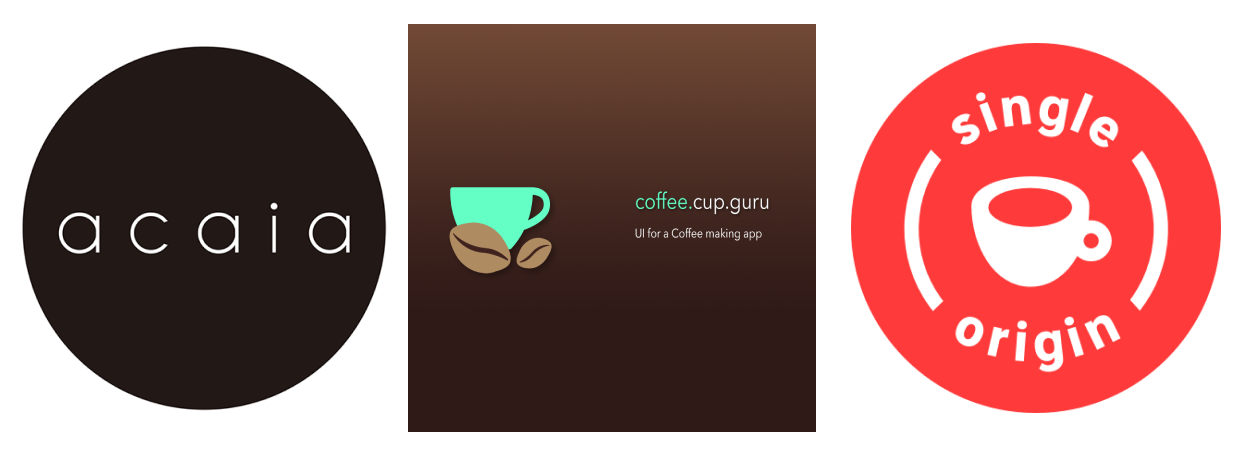
I was slightly surprised to find that there weren't many mobile apps that provided an all-in-one coffee brewing aid. Acaia, the most popular and robust brewing app was a companion to their proprietary digital scale. I reviewed the apps and recorded the time and actions required to complete the task of making a cup of coffee via the pour over method. I made additional notes about the designs, behaviors, frustrations, and intended users for each product.
Each of the apps provided a similar auto-calculation tool as their main feature and support for multiple brewing devices/methods, but that was the extent of the product overlap. Coffee.cup.guru was the only truly free to use app, but towards the end of my project the app was no longer available on mobile app marketplaces. Acaia was free to use, but required an integrated experience with digital scale to allow users to take advantage of it's sharing features and pour rate graph. The Single Origin app was only purchasable through the Apple App Store.
The design differences between each app were significant and affected the experience as well as accessibility. Acaia's visual style was minimal and used thin fonts which made the app difficult to read on a mobile device. Coffee.cup.guru was the only app that utilized different hues of brown, but some of their color pairings failed to meet WCAG requirements. Single Origin used cursive for their text, which could negatively impact users who don't use English as their main language and can add more cognitive demands for task completion.
Seeing stark differences in a small pool of competitors, created a challenge of defining a baseline experience to start from.
Contextual Inquiry
I observed 5 participants preparing a cup of coffee. In this exercise I recorded their process, timing, artifacts used, and reactions (verbal and non-verbal). I then conducted a small interview asking why they took a certain action, used an aid, or reacted a certain way. I noticed that everyone was very dependent on their mobile phones to calculate weight and for the timer. There was a high level of inconsistency on task completion times where 2 of the 5 participants finished well over the 2 minute and 30 second target while the other 3 participants finished earlier than planned. Also noted was that neither of the participants setup notifications on what step they should transition towards.
User Interviews
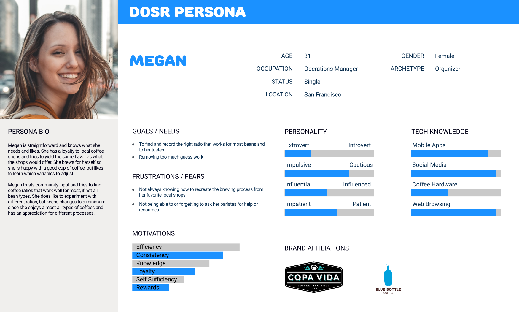
I interviewed 5 regular coffee consumers who had varying levels of experience in home brewing. I asked each of the participants to walk me through their process, which methods they used, how they would define success for their task, and what pain points they may have. The feedback and observations from the interviews helped me to draw out more detailed needs, motivations, pain points, and similar traits which were then used to create personas.
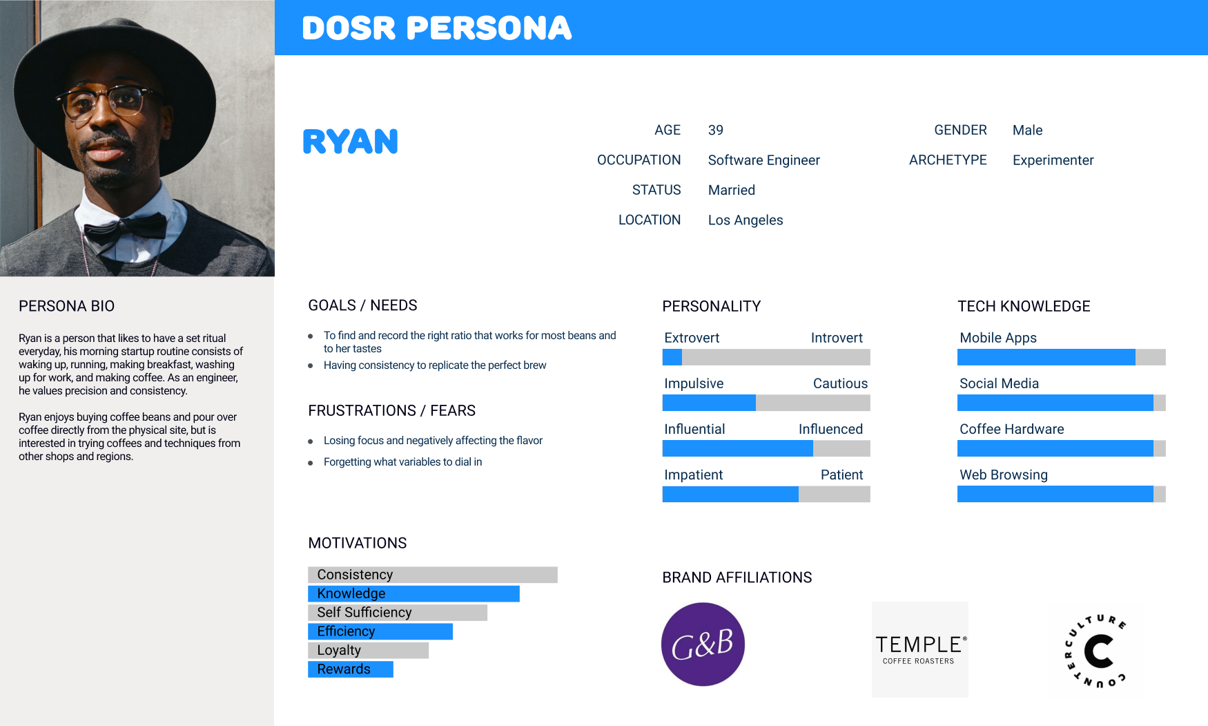
Personas
Unsurprisingly, there was a lot of participant interest from various age groups, occupations, personality types. To help create an ideal persona for the DOSR app, I selected people who used their mobile devices to complete tasks at a much higher frequency. Even within this group, there were big differences in the traits of the personas.
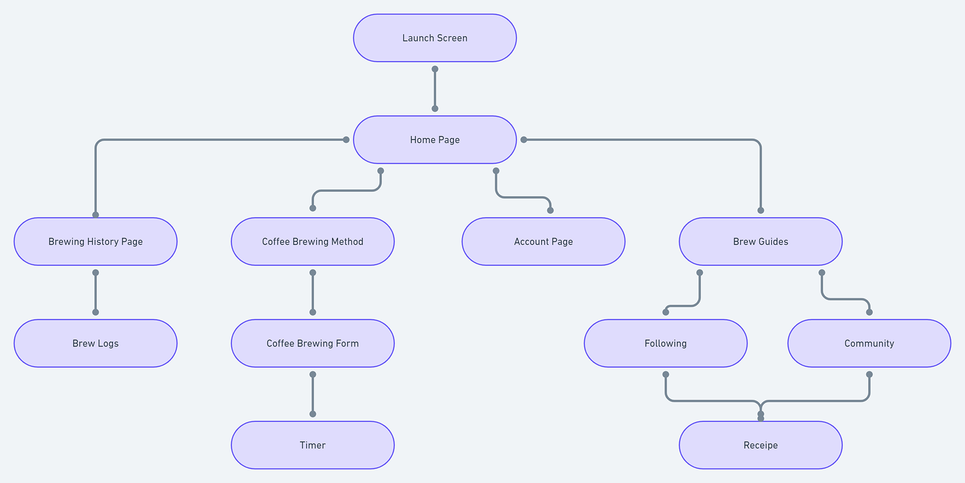
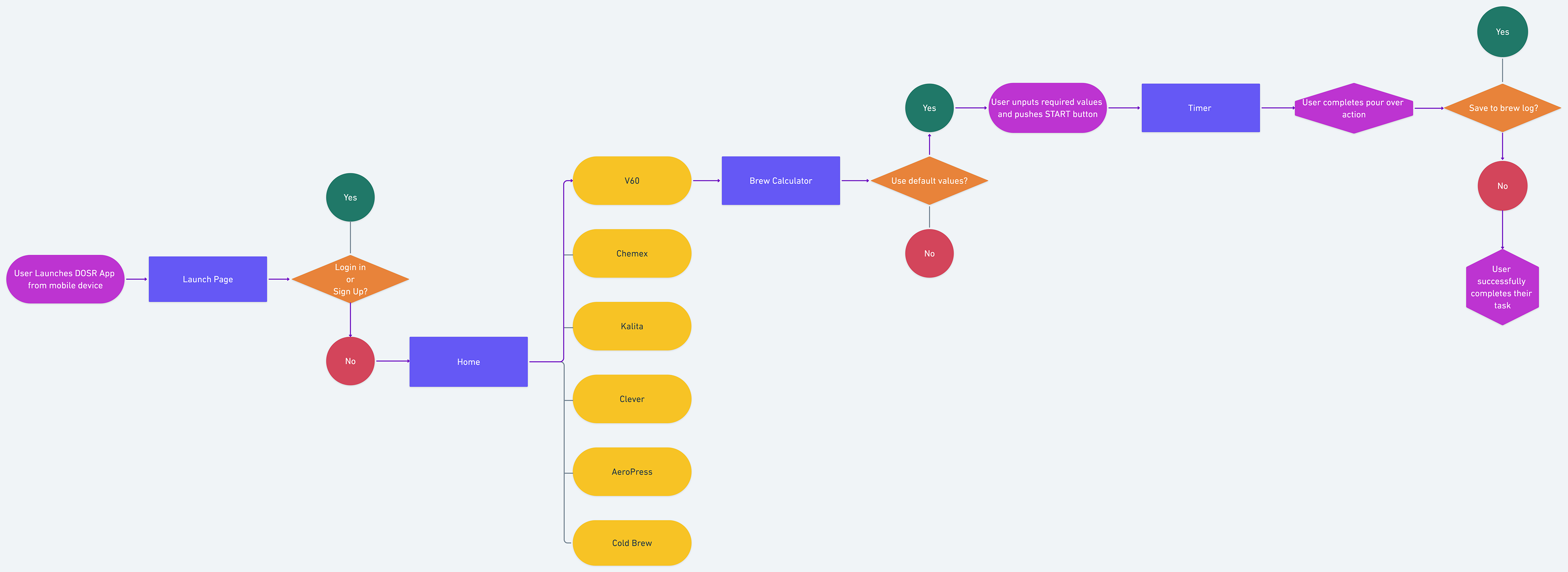
Site Map & User Flow
Design
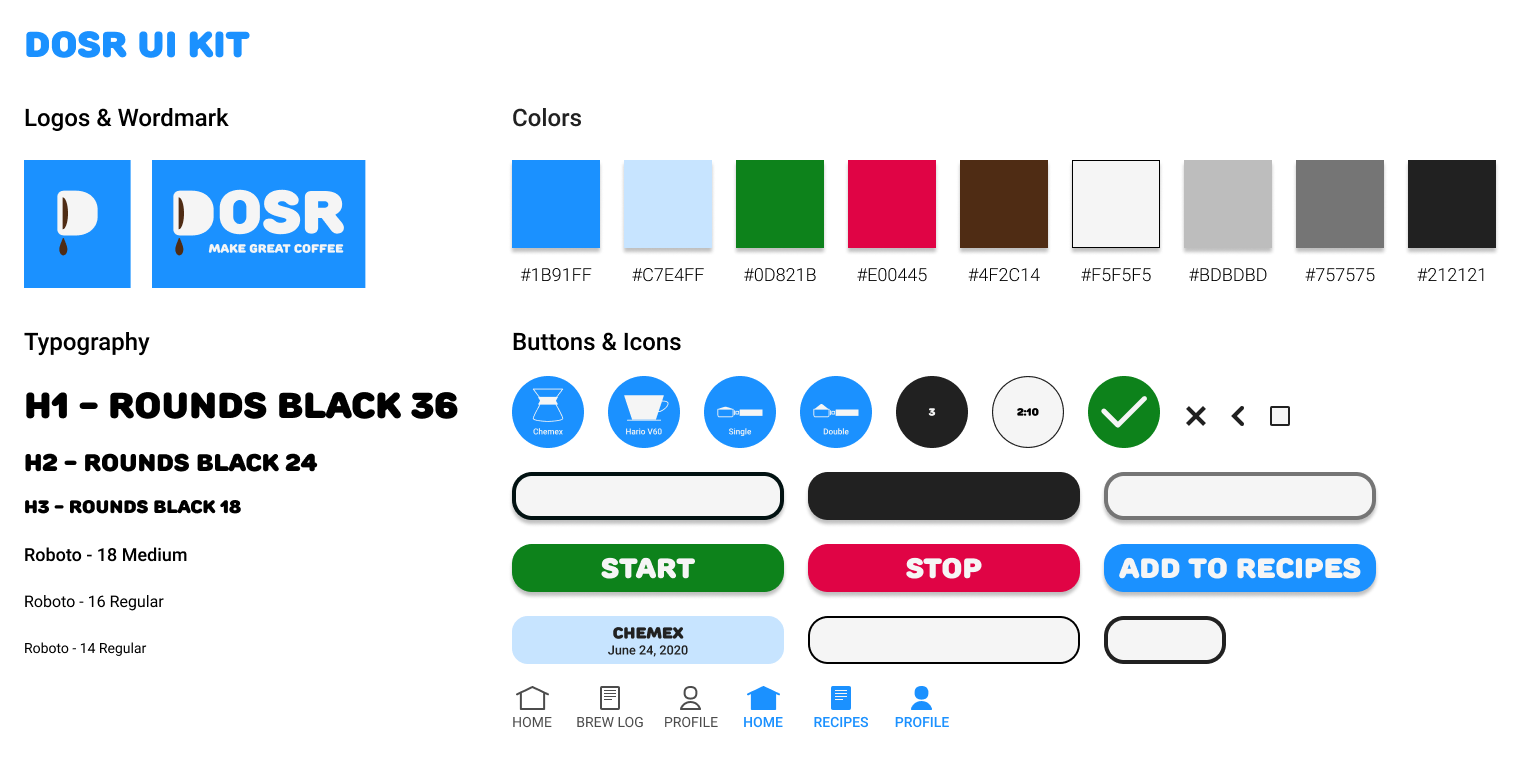
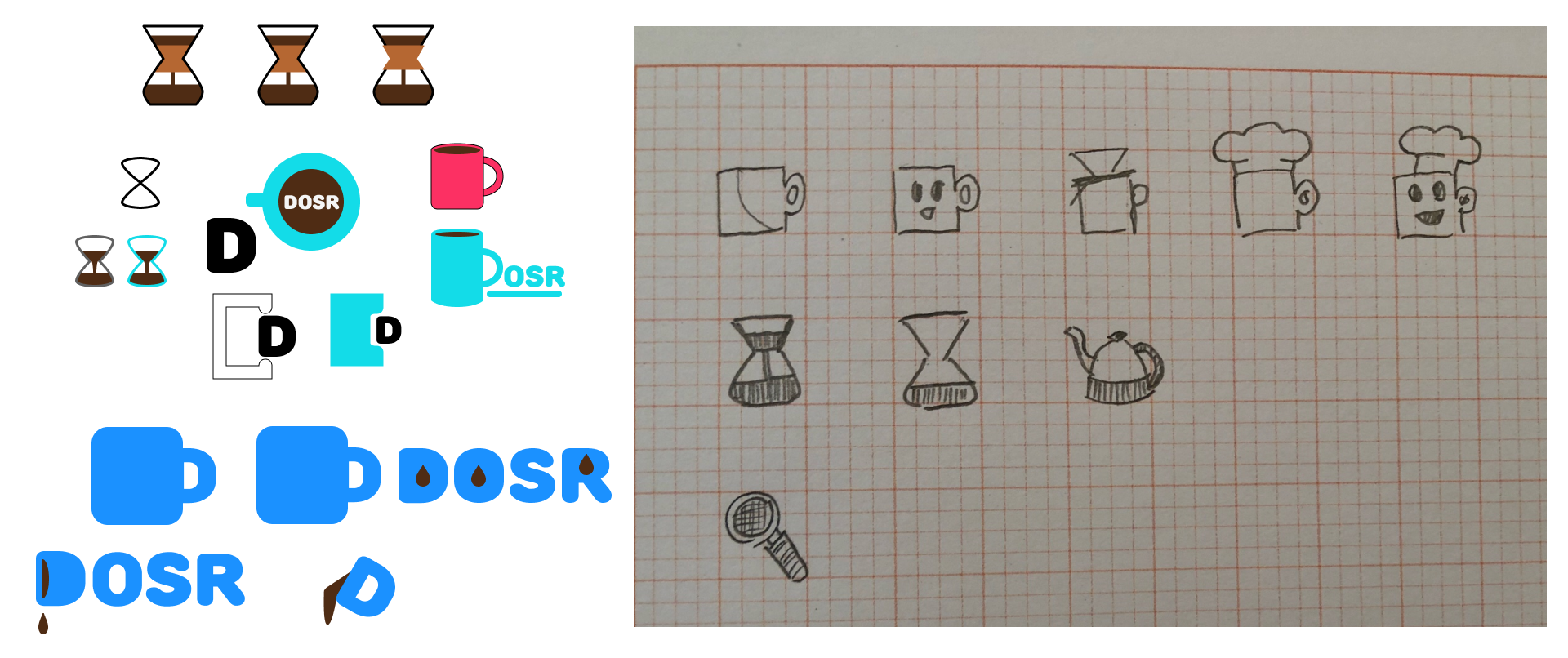
Many coffee applications used brown hues as their main brand color, DOSR wanted to avoid this since it created several limitations in terms of finding complimenting colors that were accessible. Since users were making coffee for a pick-me-up at the start of their day or after lunch, we wanted to use a vibrant color palette as a way to make the experience feel more lively. Water is often regarded as the most important part of the brewing process, blue (#1B91FF) was used as the main brand color and to reflect this thought. To keep in line with improving accessibility, Rounds Black was used as the brand font since it was playful and had enough weight for better legibility. I was constantly addressing the feedback of the users to make their task and app interactions to be as easy as possible.
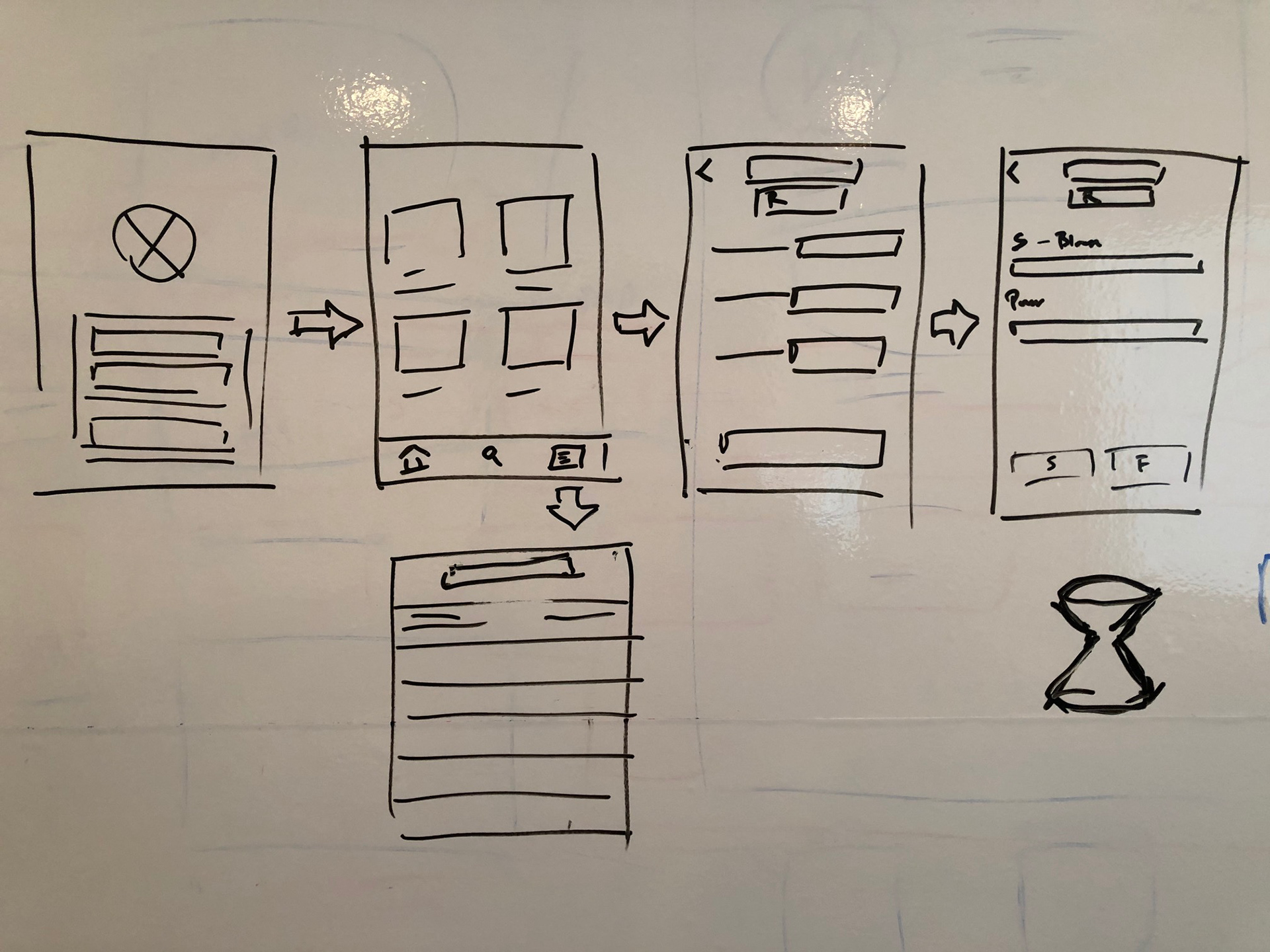
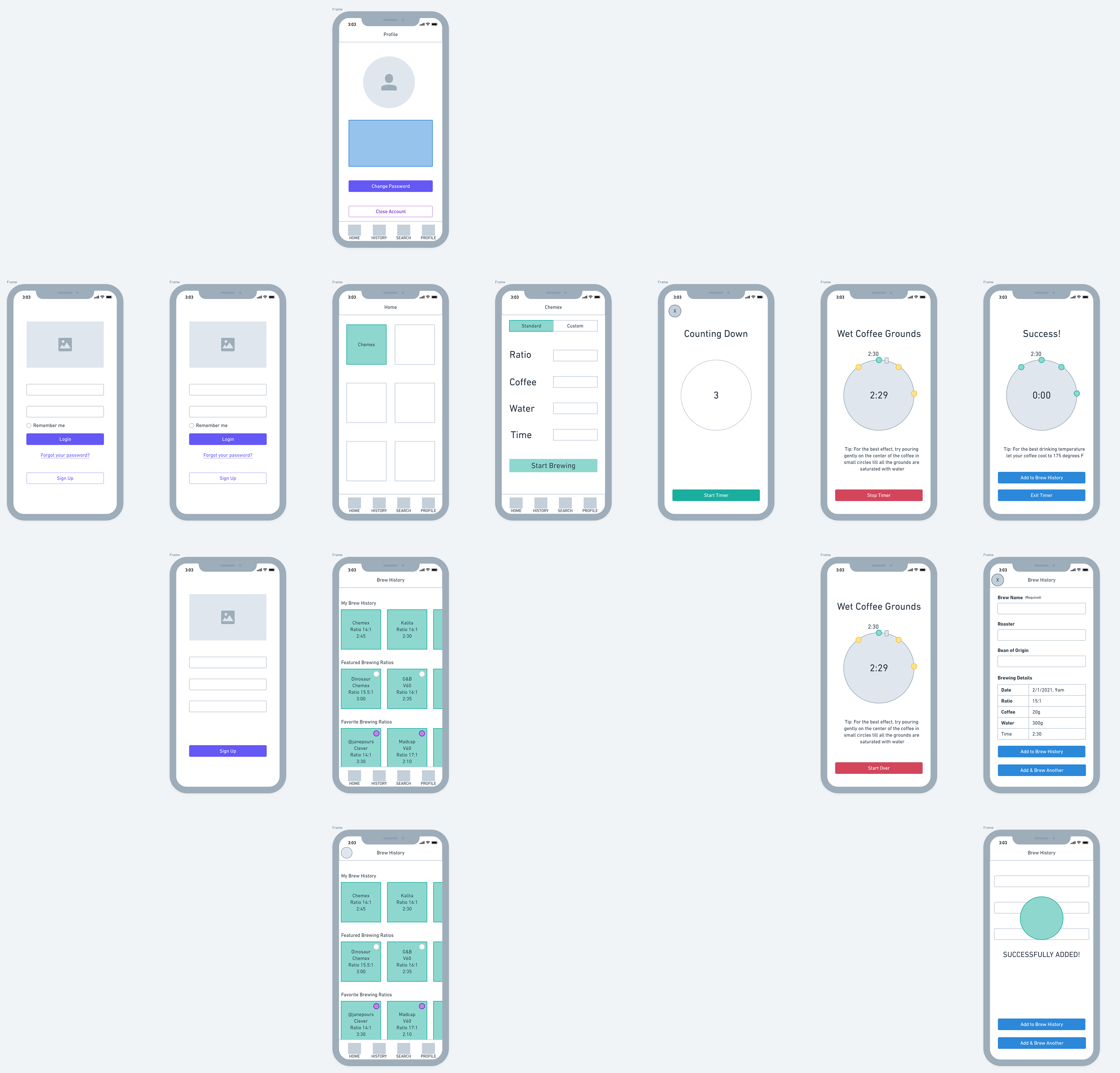
Wireframes
Testing
Testing Method
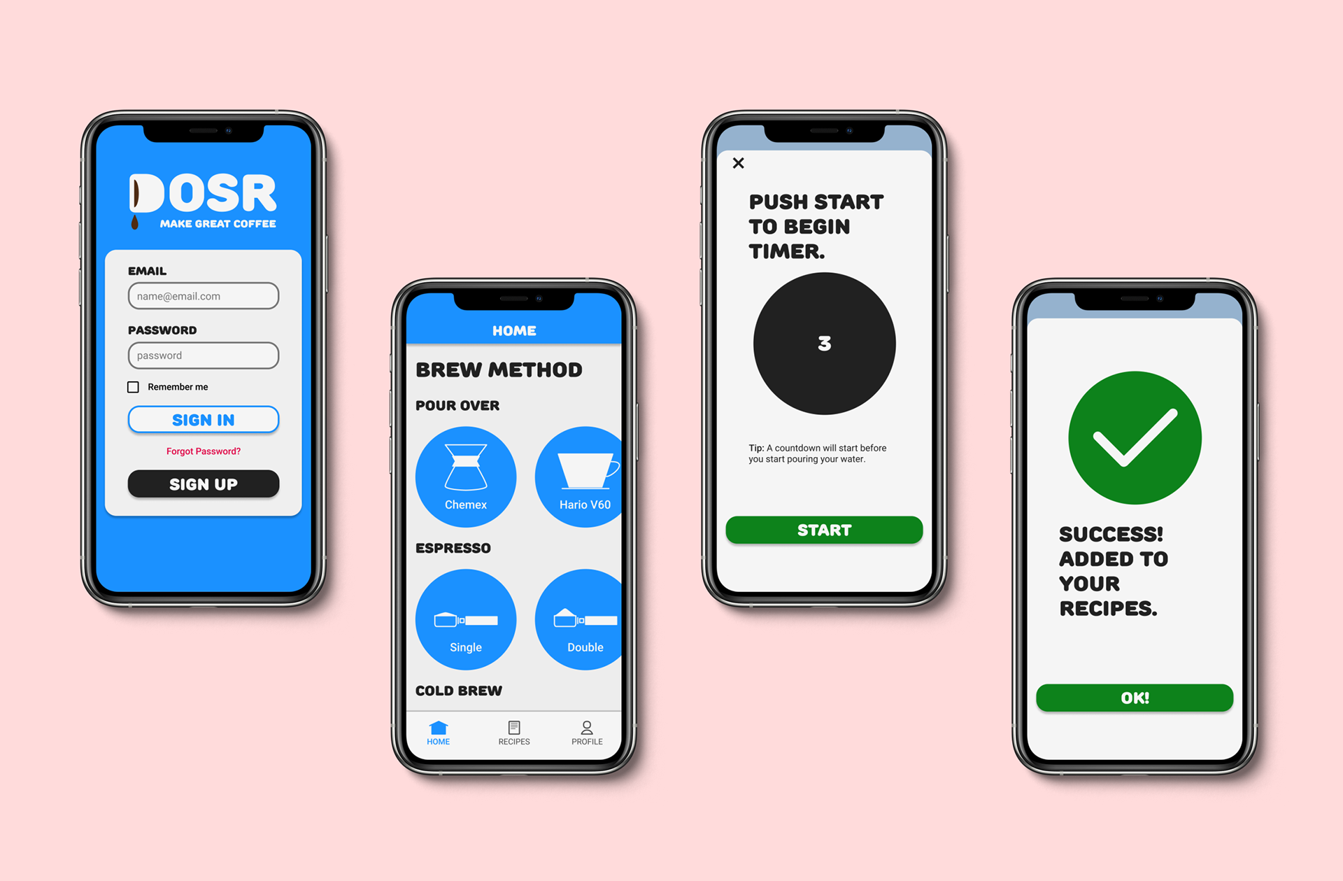
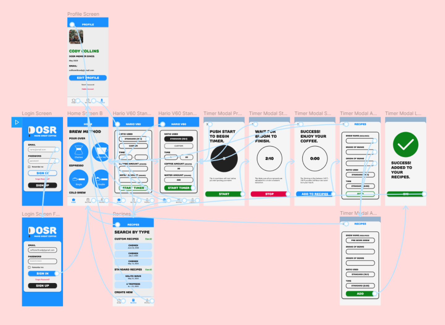
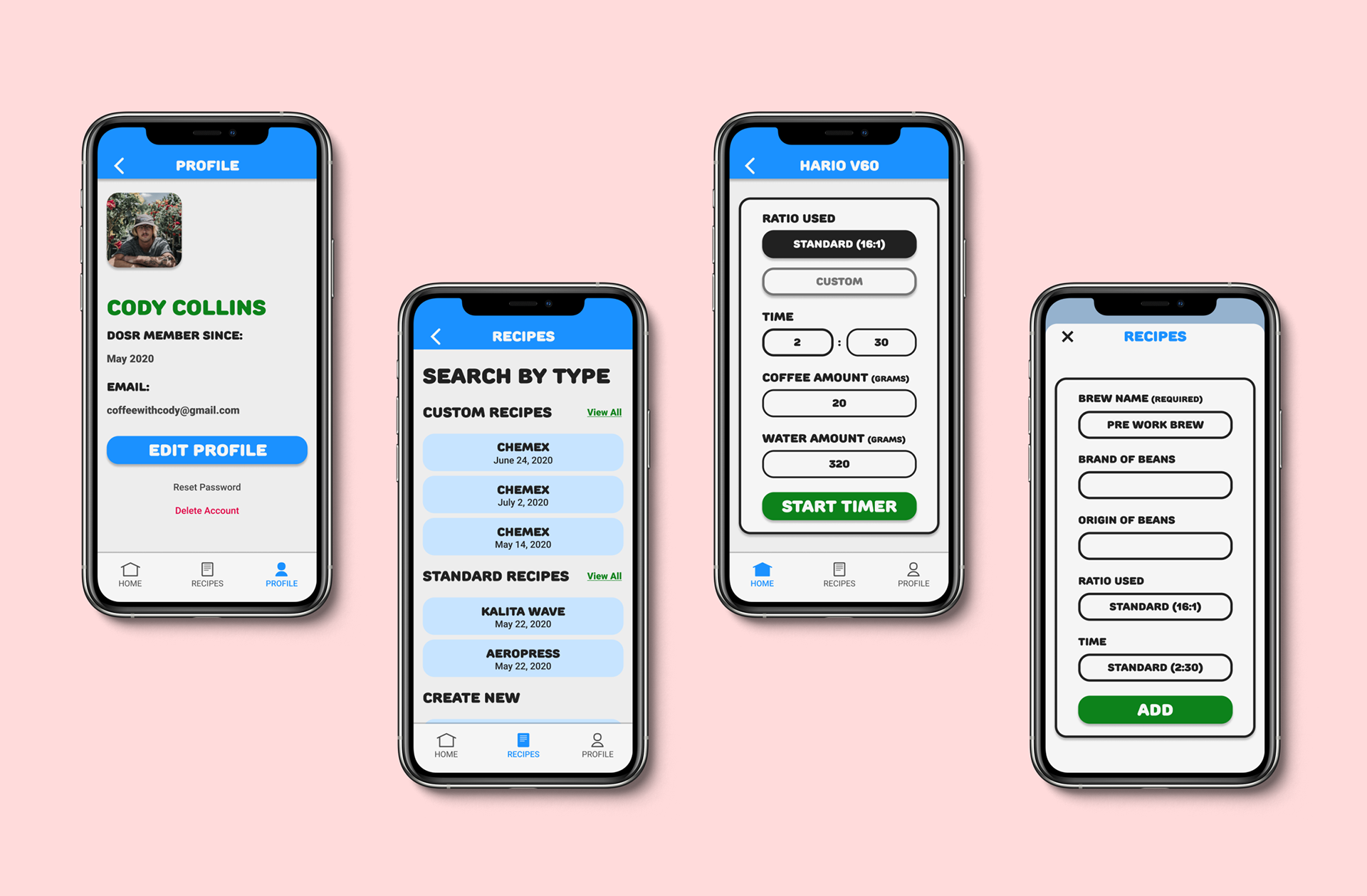
I created the DOSR prototype in Figma then linked my frames to Maze as my testing platform. Participants were asked to complete a task of: logging into the app, selecting the Hario V60 as the pour over method, using a standard brewing ratio, running the pour over timer, and logging their recipe information.
Testing Results
All participants were able to successfully complete their task, with an average completion time of 43 seconds. One participant felt that the brewing form was difficult to read since there was too much color. All participants mentioned that the instructions were clear and easy to follow. The task of logging the pour over session data was met with the most misclicks since one of the participants ignored the instructions and wanted to enter information in an inactive text field.
Conclusions
Based on the feedback and the testing analytics, I made the appropriate revisions to the brewing and log forms by reducing the amount of colors to form fields. The form revisions were well received by users and improved their focus. Having a color palette and style that was very different from our competitors helped the brand stand out more in a positive way. The styling to the timer added a gamification effect where the users felt like they were being encouraged to follow the timing and processes.
The app has been handed over to developers to implement these designs for an alpha release. Due to limited scope for this product iteration, advanced features were not tested. If there were more time, I would have conducted a study for the social and B2B features for the app.